Showing posts with label henri matisse. Show all posts

Wednesday, June 4, 2014

Cezanne Inspired Still-Life with Apples

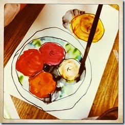
We look at several still lifes by Cezanne and Matisse for this 1st grade project. Day one is drawing the plate (I let some trace large butter lids...) and we draw at least 4 apples from a "bird's eye view"...

I put out trays of warm colors in tempera and they paint their apples after outlining with black sharpie or black oil pastel.

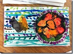
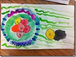
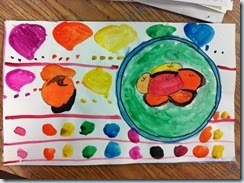
Day two we paint the plate and the table with contrasting cool colors. I used watercolors this year...and I demonstrated how to add shadows. I love how younger kids almost grasp the idea of a shadow but they inevitably make it wayyyyy to dark and it takes over whatever they so carefully painted earlier that week. Oh shadows....ruining paintings for years now. :)

I love these though.

Technology Inclusion: I use the ladibug (document camera) to project a still-life from my desk onto the screen. This really helps them all see the same viewpoint and they can observe realistic colors in the apples while they're painting.

IMG_4540IMG_4541IMG_4542IMG_4543IMG_4544IMG_4545IMG_4621IMG_4622IMG_4623IMG_4624IMG_4625IMG_4626IMG_4627IMG_4628

IMG_4629

Here's my watercolor drawer. I use Prang watercolors...with a couple of Crayola refills mixed in there. Each student gets their own tray and returns it when they are finished. On this particular day, with one of my worst classes, I walked by this drawer towards the end of class after everyone had cleaned up and noticed the watercolors were all perfectly returned and all in very neat rows. I applauded them for being so considerate with the art supplies and was genuinely proud of my little monsters!

IMG_4739IMG_4733IMG_4734IMG_4735IMG_4736IMG_4737IMG_4738

Love some of these creative backgrounds/tablecloths by FIRST GRADERS!

apples-1916still-life-with-apples-paul-cezanne640px-Paul_Cézanne,_Still_Life_With_Apples,_c__1890

Here's some of the Cezanne and Matisse paintings we describe, analyze, compare/contrast at the beginning of this lesson.

Monday, April 7, 2014

Underwater Unit with 1st Grade

After reflecting on this unit, I have concluded that it is very enriching.

IMG_3790IMG_3791IMG_3792IMG_3793IMG_3794IMG_3795IMG_3796

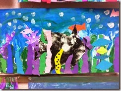
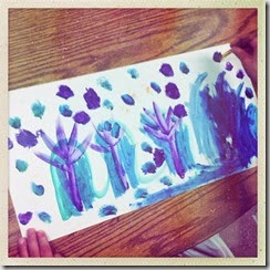
There are several ways to do this project….which is something I’ve been experimenting with for the past 5 years. Since I’ve been teaching, I have always taught some kind of underwater themed project. This year with the first graders I have even been experimenting within the grade level. Some classes tried a ‘salt painting’ technique with tempera paints which was subtle but still interesting for the background. Others used tempera paints to mix cool colors…which turned out to be my favorite.

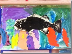
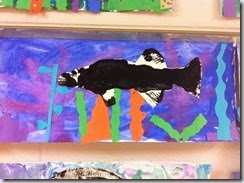
We also dabbled in GYOTAKU, the ancient Japanese art of printing fish. Gyo meaning fish and taku meaning impression or rubbing. (Keyword: rubbing…that works best.)

Day One:

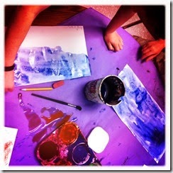
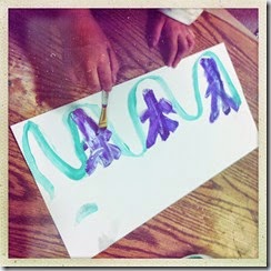
Painting the background with cool colors.

IMG_3668IMG_3120IMG_3121IMG_3122IMG_3123IMG_3124

Here you see some of the salt painting in action. They used a lot of salt! It was messy.

IMG_3125IMG_3127IMG_3412

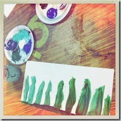
I prefer the plate of tempera paint for this background….I used white, green, blue and purple.

IMG_3413IMG_3414IMG_3415IMG_3416IMG_3417IMG_3418IMG_3419IMG_3628IMG_3629

Day Two:

Creating like Matisse…drawing with scissors to collage seaweed and coral reefs into the middleground.

IMG_3358IMG_3359IMG_3360IMG_3361IMG_3362IMG_3630

Day Two or Three:  Gyotaku

This year I finally bought those rubber fish for Gyotaku! I have really enjoyed this process and found the best way for me…

IMG_3657IMG_3658

Here’s how I set up my “Gyotaku Table”…whoever sits here just merged into other tables for the class period….luckily I had enough space to do that.

IMG_3659IMG_3660

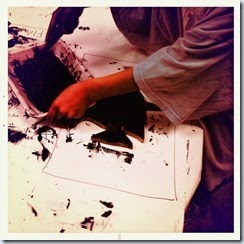
The first day I experimented with black tempera paint (cause I was afraid of the mess..) and let the kids pick the fish up to print it onto their paper. That was really really messy.

The next class I tried this with, we used brayers with black printmaking ink. We pressed and rubbed our paper into the fish…this was much better. I realize this is the ‘correct’ way to do it, but I had to at least try the other way. Their prints still turned out okay, but the detail was way better with the ink.

IMG_3661IMG_3662

IMG_3663IMG_3664IMG_3665IMG_3666

IMG_3793

“Pirana”